Raw Trading Ltd
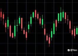
K-Line charts, also known as candlestick charts, are widely used in the financial industry to analyze and interpret price movements of financial instruments such as stocks, currencies, commodities, and indices. These charts provide valuable insights into market trends, patterns, and potential future price movements. Let’s delve into the details of K-Line charts and their significance in the financial industry.
K-Line charts consist of individual “candles” that represent a specific time period, such as a day, week, or month. Each candle displays four key price points: the opening price, closing price, highest price, and lowest price during that time period. The body of the candle is colored or filled to indicate whether the price has increased or decreased during that period.
When the closing price is higher than the opening price, the candle is typically colored green or filled with a solid color. This indicates a bullish or positive price movement, suggesting that buyers have dominated the market during that time period. Conversely, when the closing price is lower than the opening price, the candle is usually colored red or filled with a different color or pattern. This represents a bearish or negative price movement, indicating that sellers have had the upper hand.
The length of the candle’s body represents the price range between the opening and closing prices. A long body signifies a significant price movement, while a short body indicates a relatively small price change. The upper and lower shadows, also known as wicks or tails, represent the highest and lowest prices reached during the time period. These shadows provide additional information about market volatility and the trading range.
K-Line charts also incorporate various patterns and formations that can help identify potential trend reversals or continuation. For example, a “doji” candle occurs when the opening and closing prices are very close or equal, resulting in a small or nonexistent body. This pattern suggests indecision in the market and can signal a potential trend reversal.
Other common patterns include “engulfing” patterns, where one candle’s body completely engulfs the previous candle’s body, indicating a potential trend reversal. “Hammer” and “shooting star” patterns are characterized by a small body and a long lower shadow, suggesting a potential reversal after a downtrend or uptrend, respectively.
Traders and analysts use K-Line charts in conjunction with other technical analysis tools, such as trend lines, moving averages, and oscillators, to make informed trading decisions. By studying the patterns, trends, and support/resistance levels on K-Line charts, market participants can identify potential entry and exit points, set stop-loss orders, and determine risk-reward ratios.
It is important to note that K-Line charts are not foolproof and should be used in conjunction with other forms of analysis and risk management techniques. They provide valuable insights into market sentiment and price movements, but they do not guarantee future performance.
In conclusion, K-Line charts are a popular and effective tool in the financial industry for analyzing price movements and identifying potential trading opportunities. By understanding the various candlestick patterns and formations, traders and analysts can gain valuable insights into market trends and make informed decisions. However, it is crucial to use K-Line charts in conjunction with other analysis techniques and risk management strategies for successful trading. IC Markets
风险提示:以上内容仅代表作者或嘉宾的观点,不代表 FOLLOWME 的任何观点及立场,且不代表 FOLLOWME 同意其说法或描述,也不构成任何投资建议。对于访问者根据 FOLLOWME 社区提供的信息所做出的一切行为,除非另有明确的书面承诺文件,否则本社区不承担任何形式的责任。
FOLLOWME 交易社区网址: followme.asia


加载失败()