Find leadership
One recent tool that many technicians have adopted is called Relative Rotation Graphs (RRG graphs) for short. This visual representation of momentum and strength in a security compared to a benchmark is a valuable tool for portfolio positioning. Invented by Julius de Kempenaer, RRGs combine two indicators of relative momentum and strength. JDK RS-Momentum measures the speed of a securities movement vs. the benchmark, while JDK Relative Strength-Ratio indicates its outperformance compared to it. By comparing these two indicators against a benchmark, we can observe the security’s rotation from higher momentum and outperformance to lower momentum and underperformance. The four quadrants of the RRG graph—Improving, Leading, Weakening, and Lagging—indicate the security’s phase relative to the benchmark. These quadrants can be utilized in portfolio positioning to identify potential opportunities within a market.
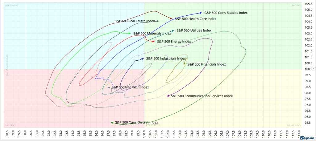
Currently, the Consumer Staples sector is exhibiting relative strength and momentum compared to the S&P 500, moving into the leading quadrant. Conversely, the Consumer Discretionary sector is losing momentum and strength, moving deeper into the lagging quadrant. This trend aligns with the recent risk-off reaction to tariff announcements that have disrupted the markets.
In this graph, I used 26-week tails to analyze the position of each sector relative to the S&P 500 over that period. Examining the tails reveals the rotation from the Consumer Discretionary sector’s outperformance to underperformance during that timeframe. These tails are helpful in being able to visualize the actual rotation within the market. The Utility sector, on the other hand, continues to advance into the leading quadrant, prompting a closer look at its constituents.
A deeper dive
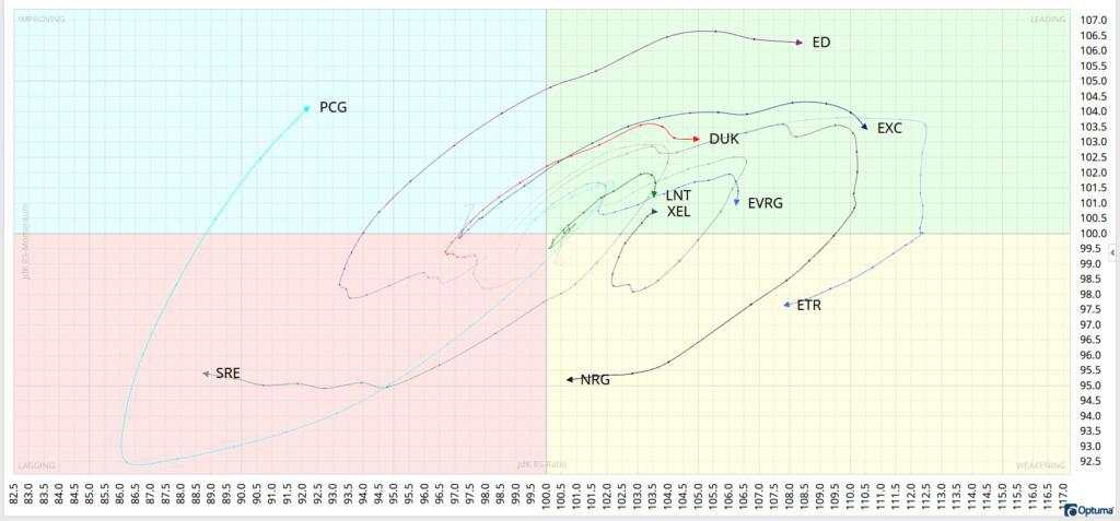
Once you’ve identified a sector showing leadership in the market, you can delve deeper to find the individual companies within that sector that are outperforming their own sector. This approach helps pinpoint leadership by not only identifying the strongest sectors within an index but also the strongest companies within those sectors. For instance, the S&P 500 Utility sector is comprised of 31 companies. I’ve narrowed it down to 10 companies across all four quadrants of the RRG graph. Now, you can assess which of these 10 companies exhibits momentum and strength against the utility sector, in addition to the overall strength of the utility sector itself. While most constituents of a benchmark tend to follow a similar clockwise rotation around it, XEL shows us an exception. It has demonstrated the ability to avoid falling behind the benchmark with continued leadership throughout the 26-week timeframe. Currently, PCG is gaining momentum, moving from down to up on the graph, while EXC appears to be on a potential path of relative underperformance vs. the sector. By utilizing RRG graphs in this manner, you can gain insights into when to enter or exit a security, providing clear visual cues of momentum and strength.
Who’s right this time?
With the ongoing tariff turmoil weighing heavily on equities, it seems that Bitcoin has been somewhat unaware of the market turmoil. Despite a slight dip of approximately -2.1% year to date, Bitcoin’s highly volatile nature makes it unlikely that long-term holders would even notice such a small change. On the other hand, the Nasdaq has been struggling to regain its footing, having experienced a significant decline of -12.8% year to date.
Interestingly, Bitcoin is now beginning to show signs of upward movement, while the Nasdaq continues to consolidate and its trends appear to be worsening. This divergence is particularly noteworthy because it goes against patterns observed in the past. Since the beginning of 2023, Bitcoin and the Nasdaq have experienced Five instances where their 30-day price correlation has moved below 0.9. In three of these cases, price divergences followed. Notably, during April 2023 and June 2024, the Nasdaq continued to rise while Bitcoin declined.
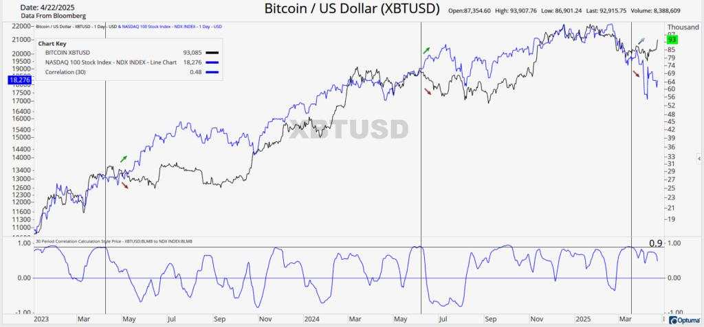
In the current divergence, Bitcoin is leading the upward trend, while the Nasdaq has continued to move lower. While it’s too early to determine who is correct this time, assets with high correlation can provide valuable insights into each other’s future movements. The question now arises: is Bitcoin truly leading the markets higher, or will the Nasdaq continue its streak of leading the way, albeit this time lower? Of course there is always the possibility that the correlation continues to break down and the divergence continues, but in the past, this has always resolved itself.
Unlock exclusive gold and silver trading signals and updates that most investors don’t see. Join our free newsletter now!
作者:CMT Association Research Team,文章来源FXStreet,版权归原作者所有,如有侵权请联系本人删除。
风险提示:以上内容仅代表作者或嘉宾的观点,不代表 FOLLOWME 的任何观点及立场,且不代表 FOLLOWME 同意其说法或描述,也不构成任何投资建议。对于访问者根据 FOLLOWME 社区提供的信息所做出的一切行为,除非另有明确的书面承诺文件,否则本社区不承担任何形式的责任。
FOLLOWME 交易社区网址: followme.asia


加载失败()